


Officeworks
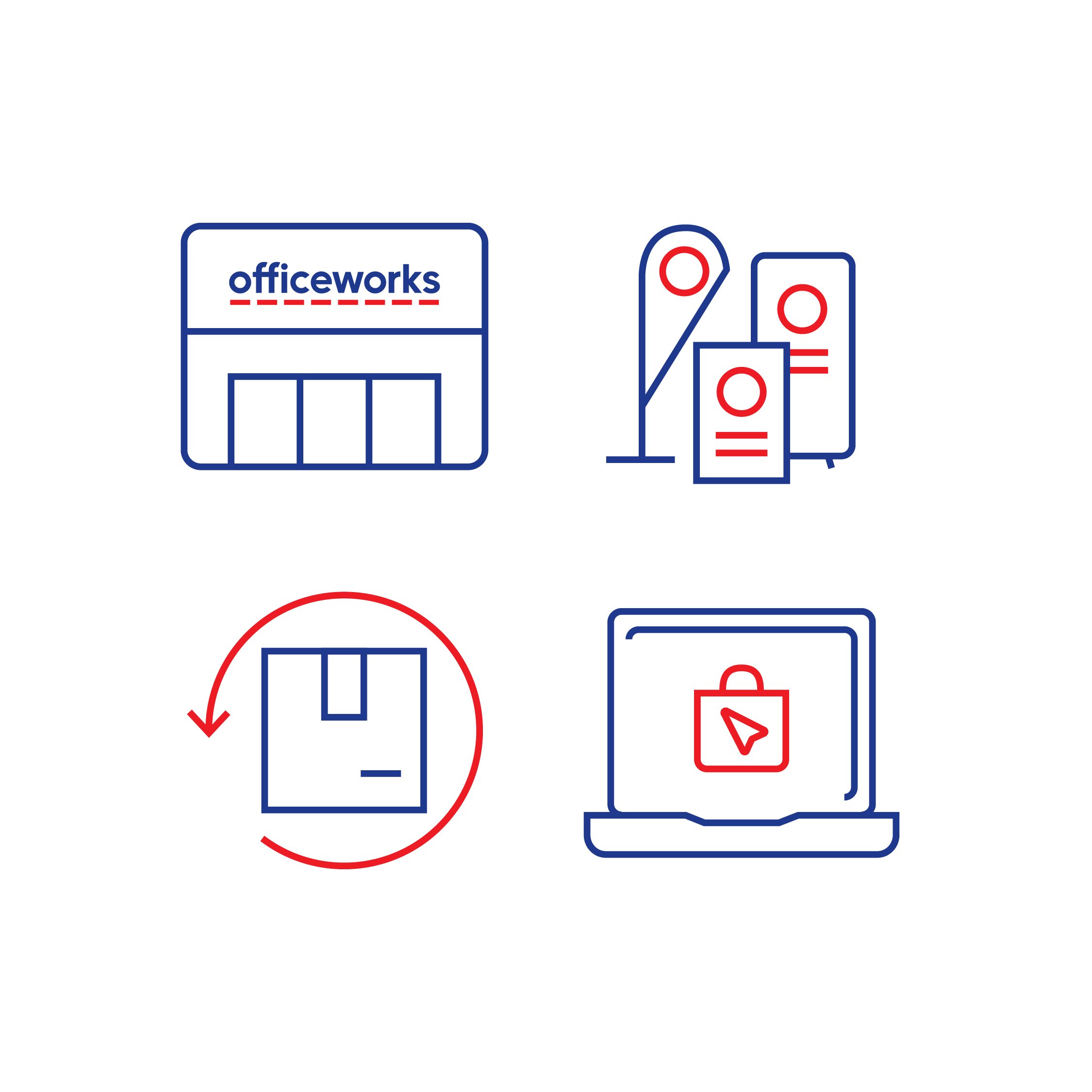
Creating a custom icon system/framework and refreshed design.
The challenge: Officeworks had thousands of icons in use with ‘inconsistent everything’, line weight, fill vs outline, area shape, angles, dimensions and no usage rules.
The aim: Create a user-friendly icon framework and consistent design which was future proof, easy to use and looks great.
Project requirements:
Needed to align to Officeworks new brand identity
Be consistent in application across all channels
Be functional – Work at small and large scale, usable and flexible
Be contemporary, engaging and have Officeworks personality
Easy to use by internal team
Creative approach delivered:
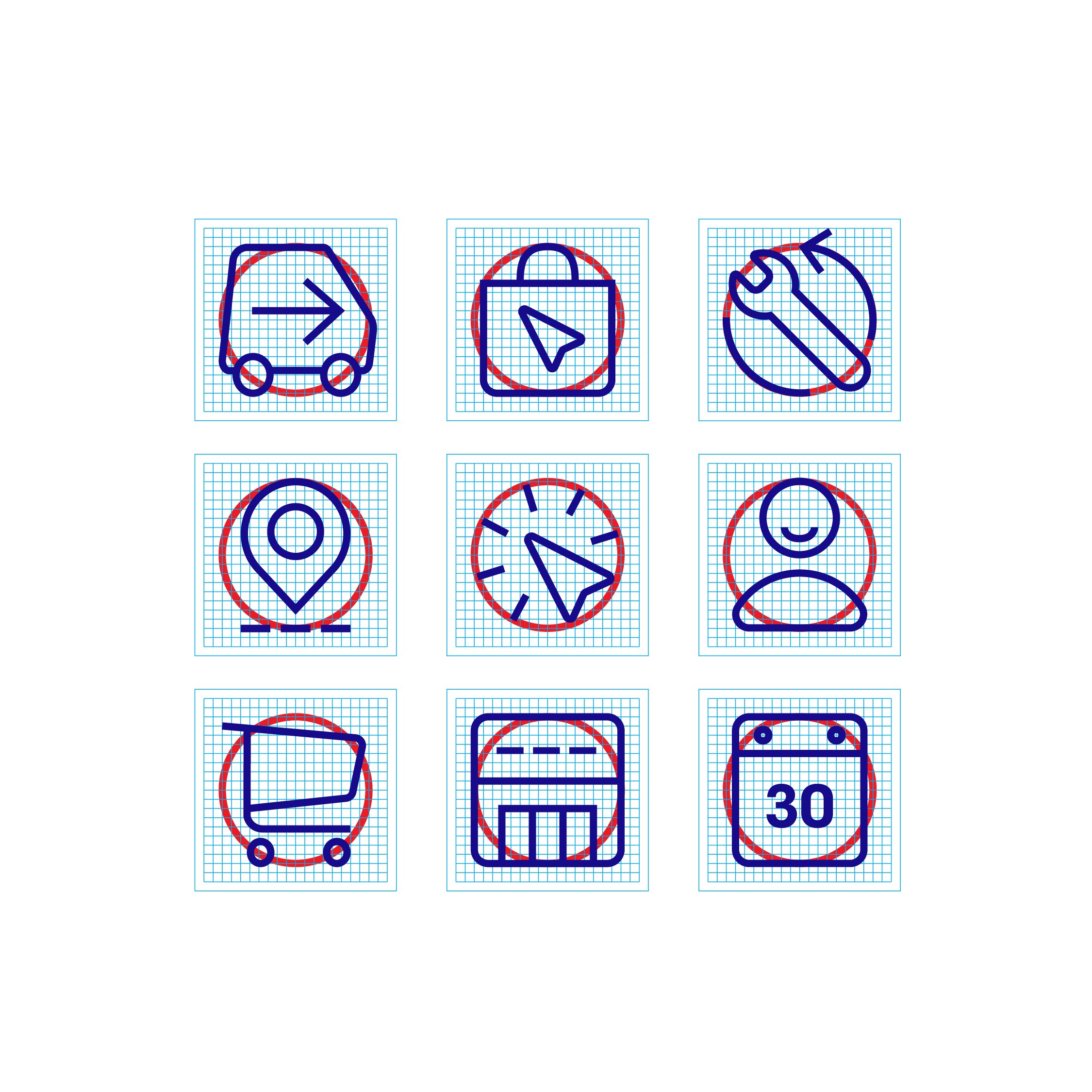
A stylised user-friendly icon suite
A future-proof framework that guides the creation and use of icons and supporting information
Icons that captured Officeworks brand refresh and personality
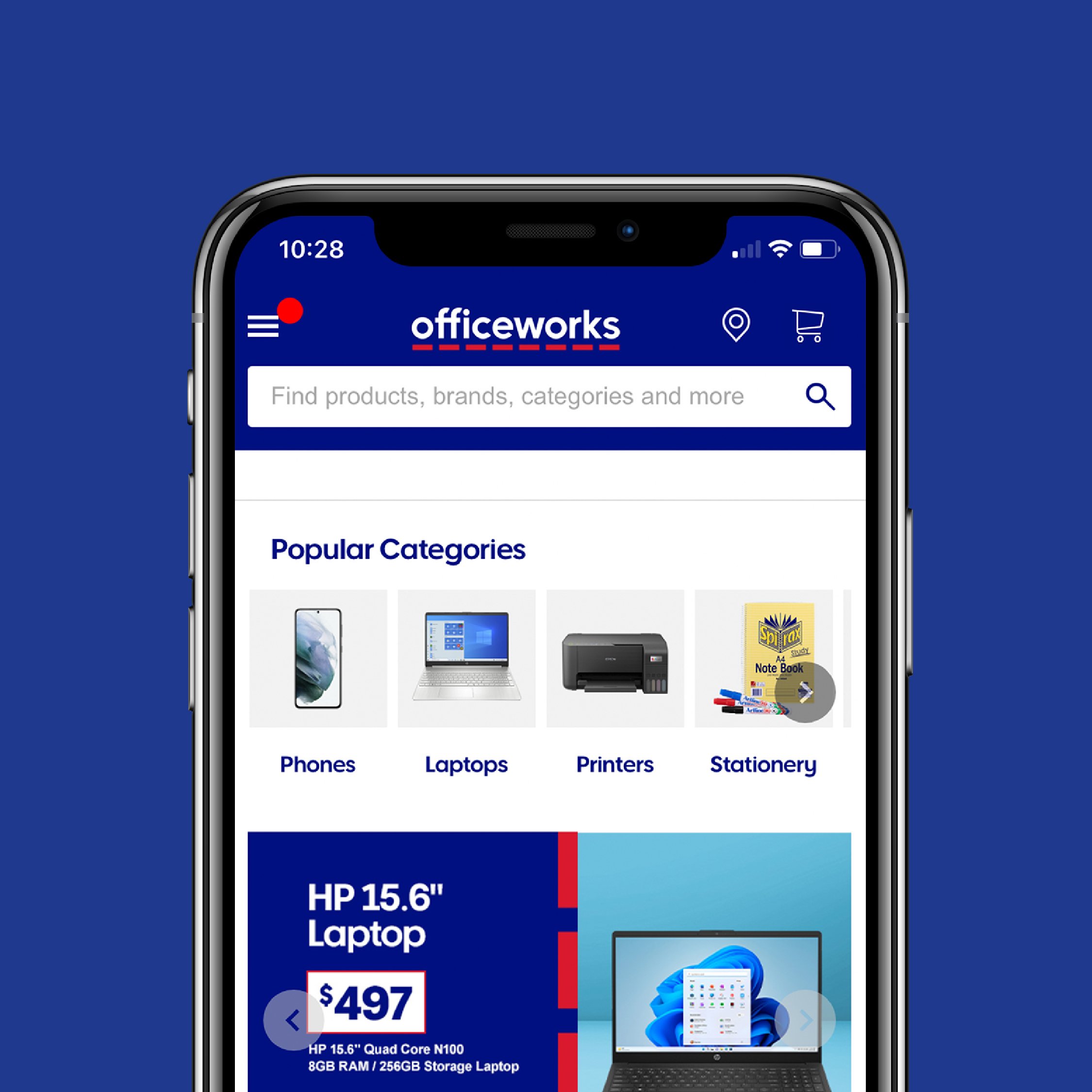
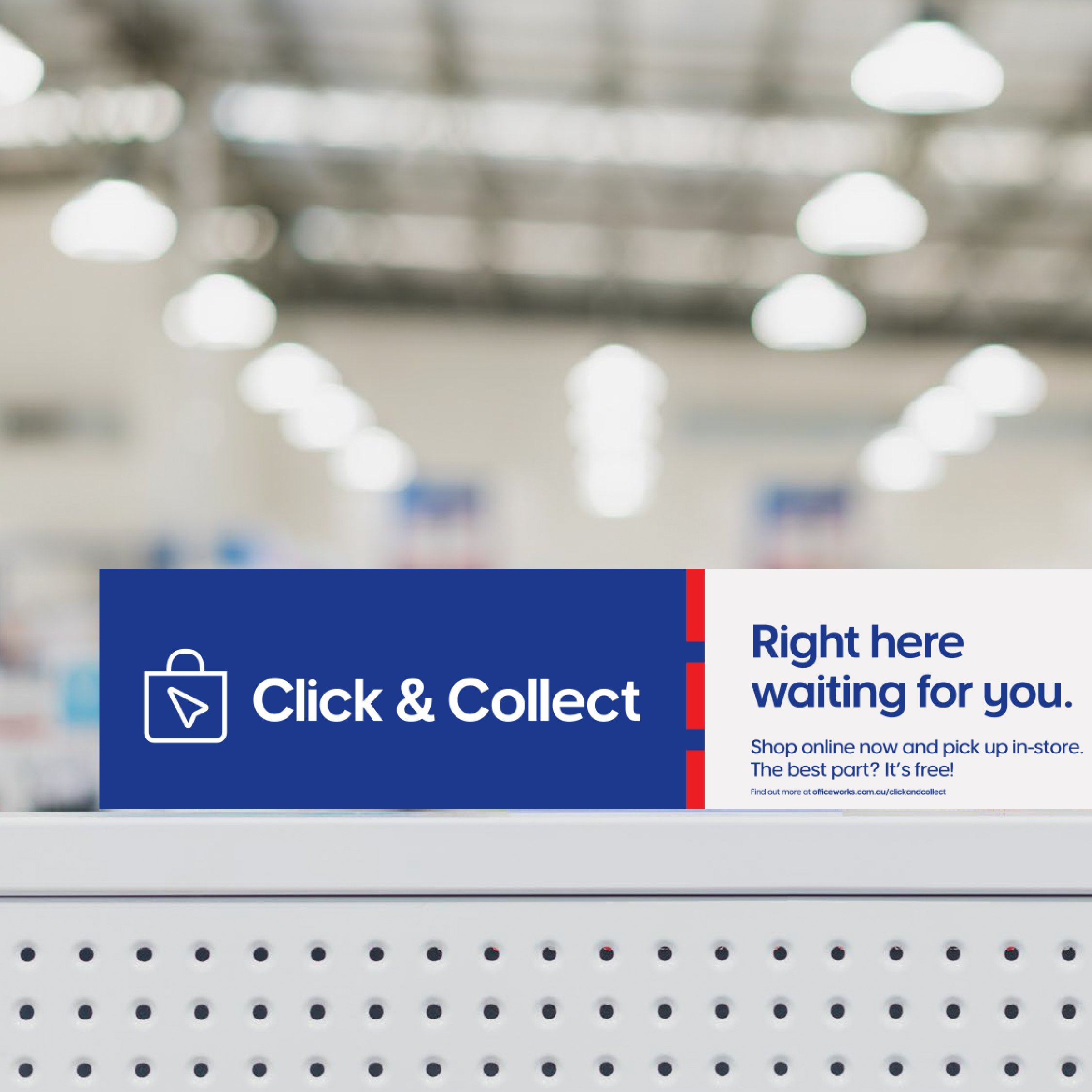
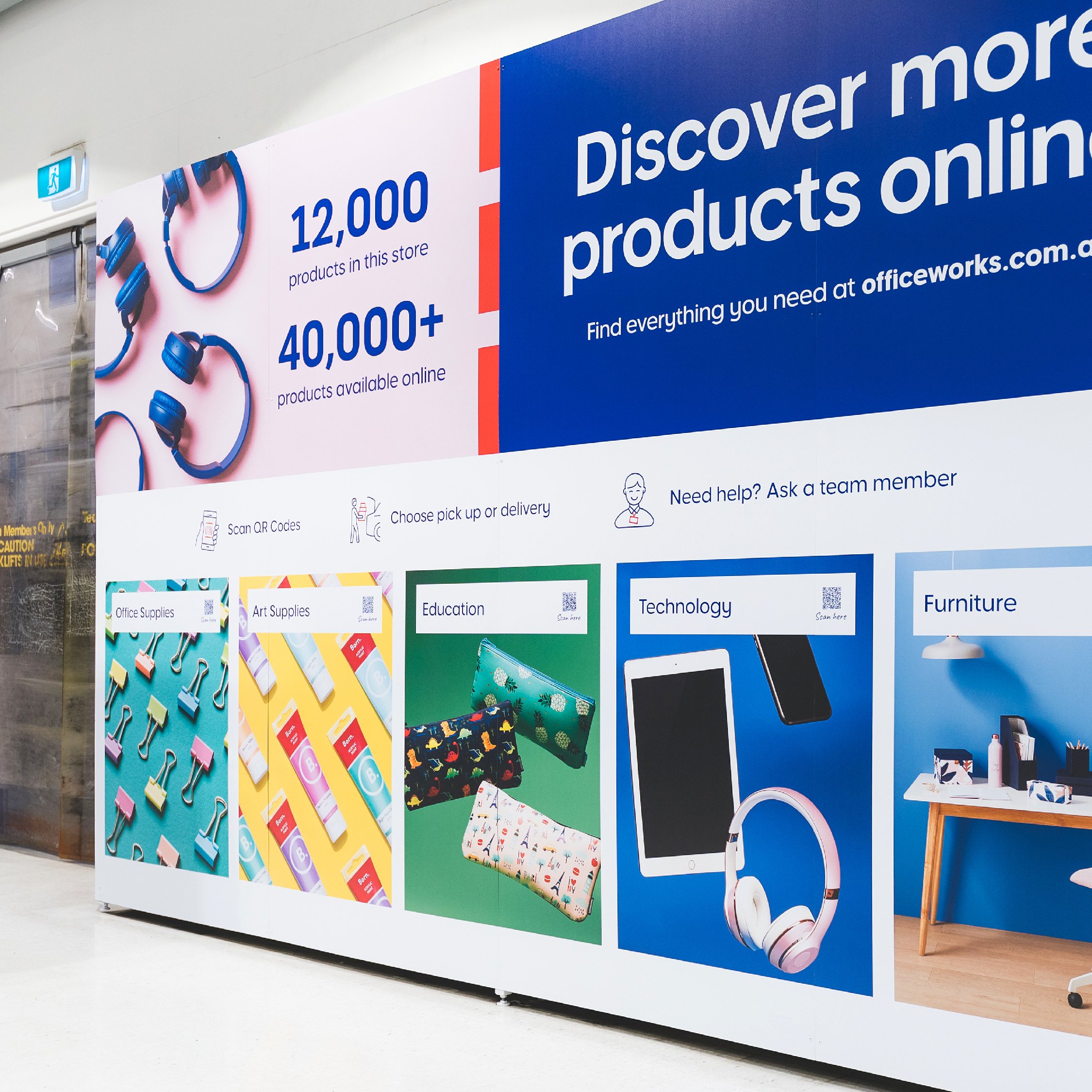
Icons that functioned in a consistent manner on website, in-store navigation and descriptive explanatory signage.
