

Moore Park View Hotel
Rebranding a proud local legend.
The challenge: Moore Park View Hotel is an independently owned family business and in the inner Sydney suburb of Waterloo. The rebrand needed to balance heritage design and modern Aussie pub.
The aim:
Create one brand image (as it had multiple logos in the marketplace),
Launch the new owners into the business by getting staff excited with a new modern look,
Provide patrons with unified brand that touched on the pubs unique history within the Sydney suburb,
Appeal to the eclectic customer base (as the venue is located in the vicinity to a golf course, football ground, race course and business district).
Project requirements:
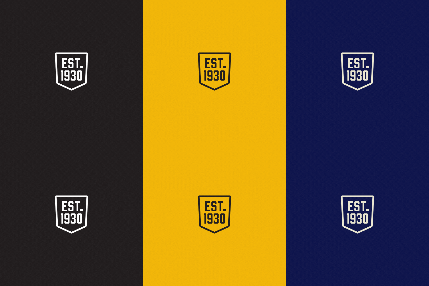
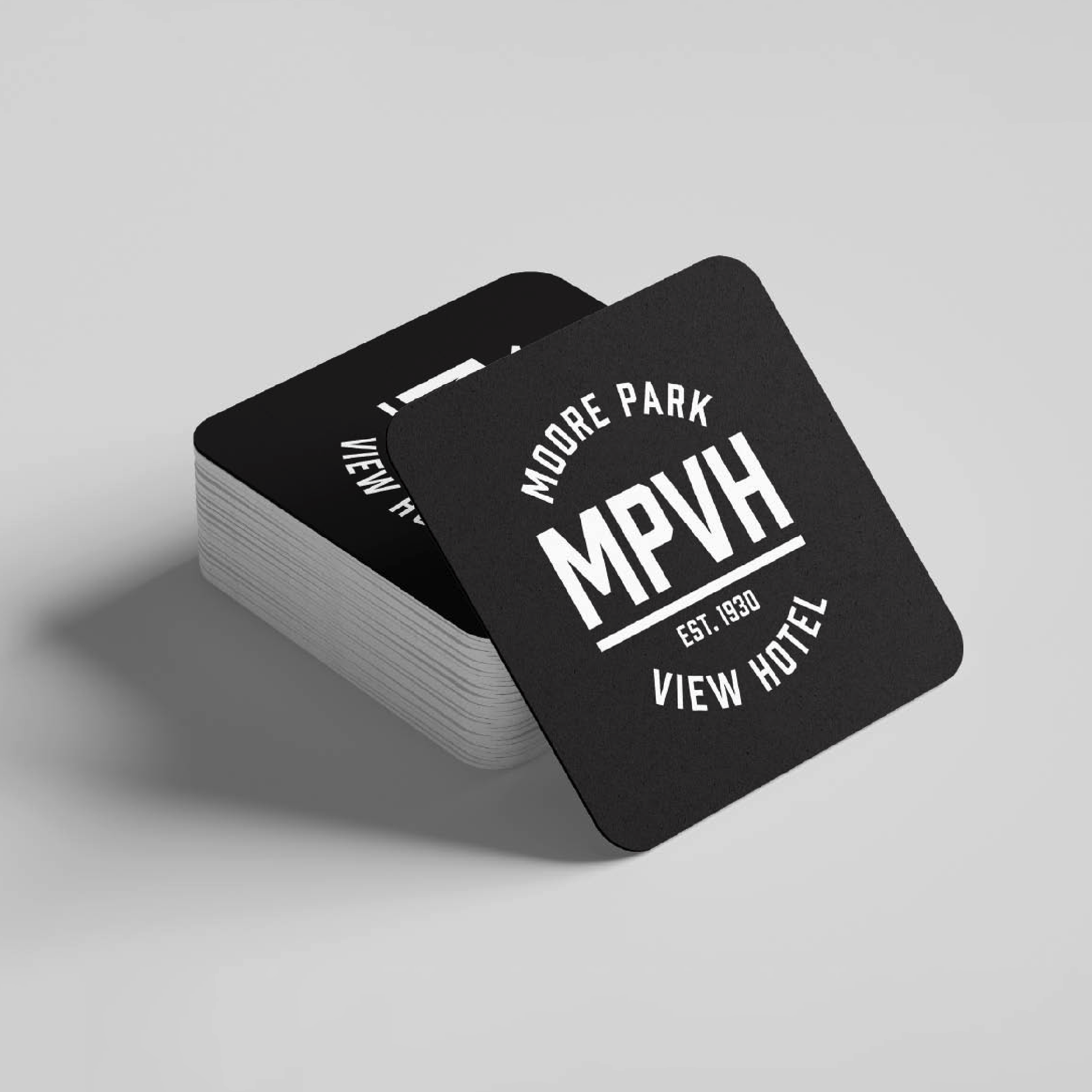
A logo suite that includes logo variations: MPVH, Moore Park View Hotel, Combined version that includes the initials/ name, and Established date.
The approach delivered:
Bold and simple type-based solution,
While predominantly printed, the logo needed to be used at small and large scale, so this needed to be a consideration,
The overall design aesthetic and colours combines modernity with a hint of heritage,
The font is paired with a bold colour palette establishing a strong brand image,
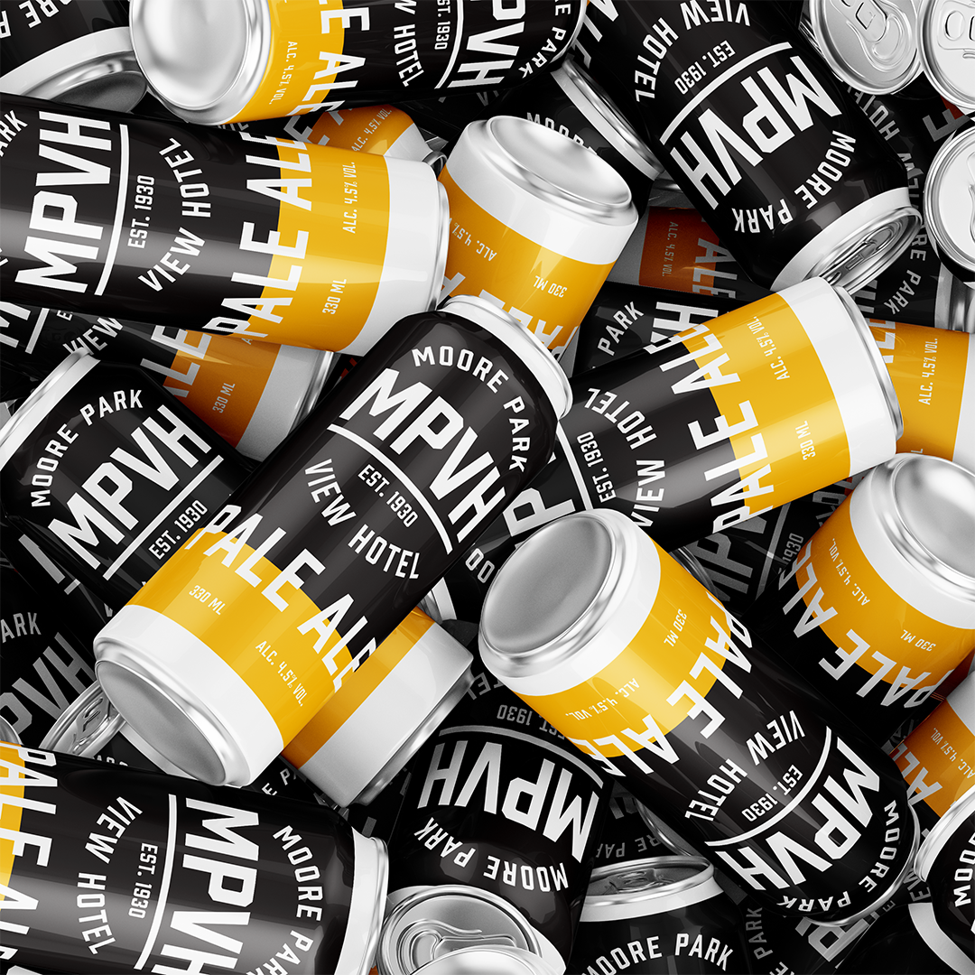
Items delivered: Brand identity, brand activation ideas, business cards, uniforms, packaging, brand overview toolkit document.
Project collaboration partner: The Cabinet Australia
