



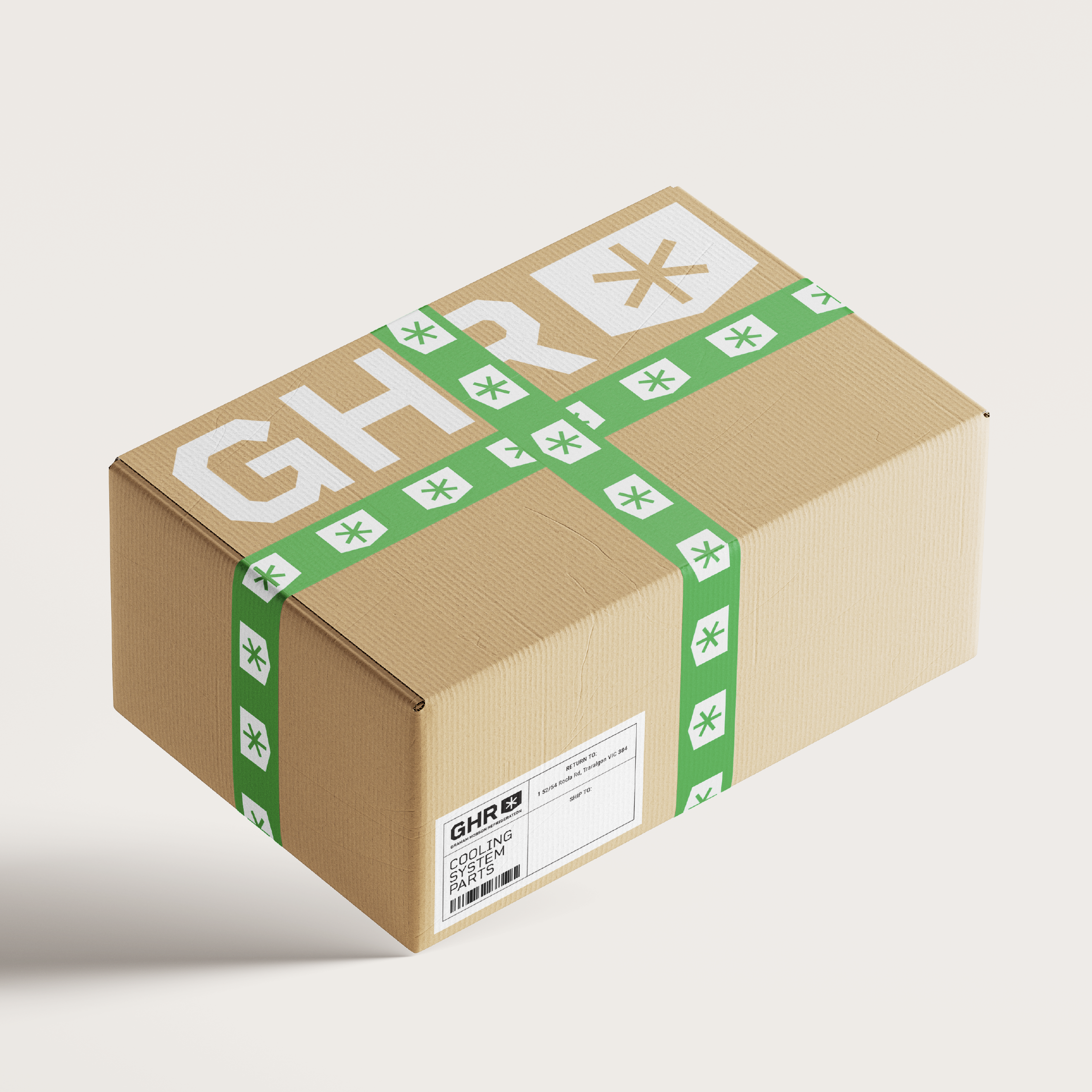


Graham Hobson Refrigeration
Re-energising a business with a brand refresh.
The challenge: Graham Hobson Refrigeration is an established family-owned South Gippsland business in the heart of Victoria. With a rich history dating back to 1970, GHR has always provided great authentic service, professional and skilled hands-on workmanship and quality products. With this in mind, Josh from GHR was keen to reinvigorate the business with a fresh, modern brand identity design.
The aim:
Create a professional, modern logo and brand identity that looks great,
Create a logo and brand identity the GHR team can be proud of,
Create a logo and brand identity that works on signage.
Project requirements:
A logo suite that includes logo variations
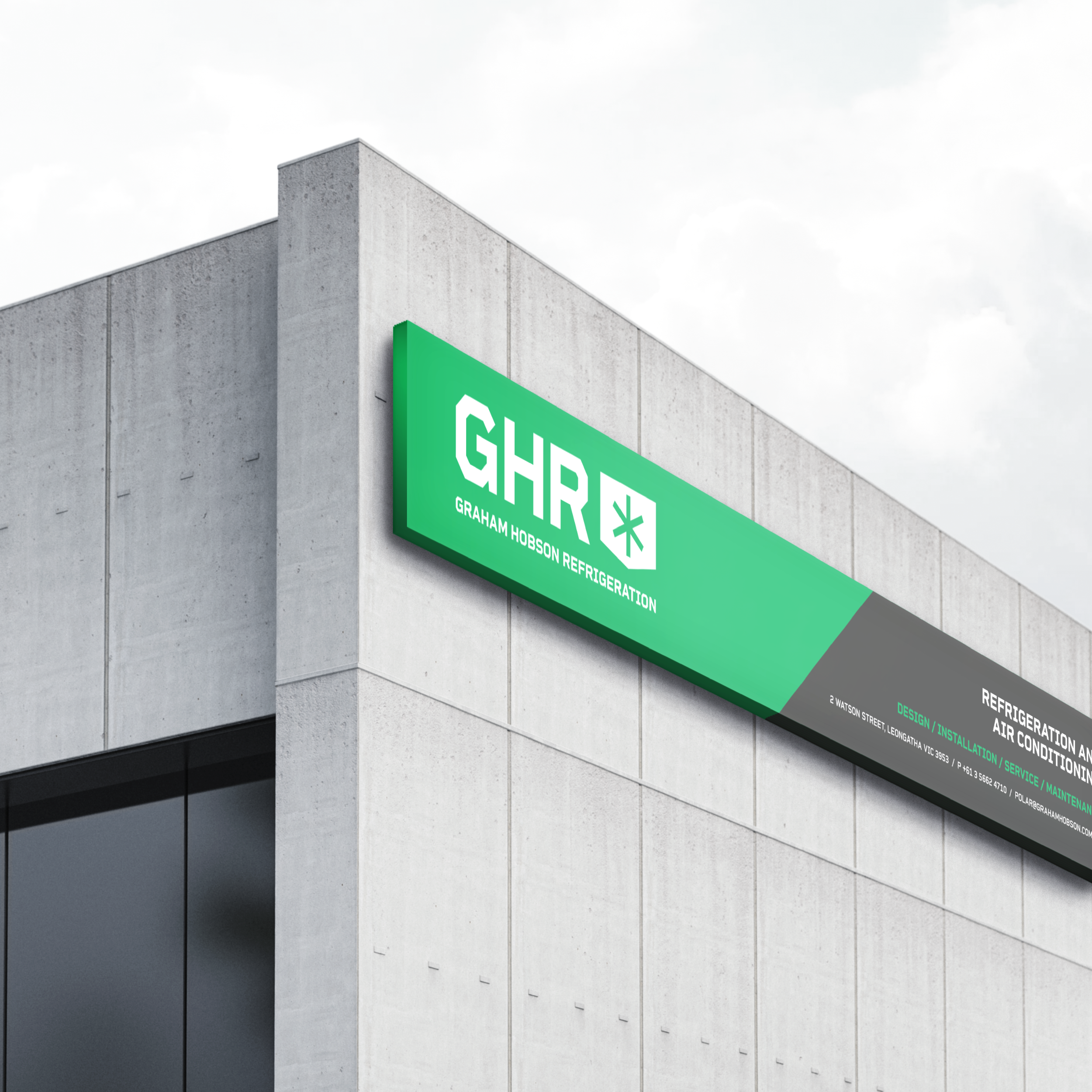
Signage
Website
Business Suite (business cards/invoice templates)
Advertising
Creative approach delivered:
Use of colour green and green variations GHR acronym use
Have a link to existing...even if it is a little bit
Design elements – logo design, typeface, colour, orientation (landscape & portrait)
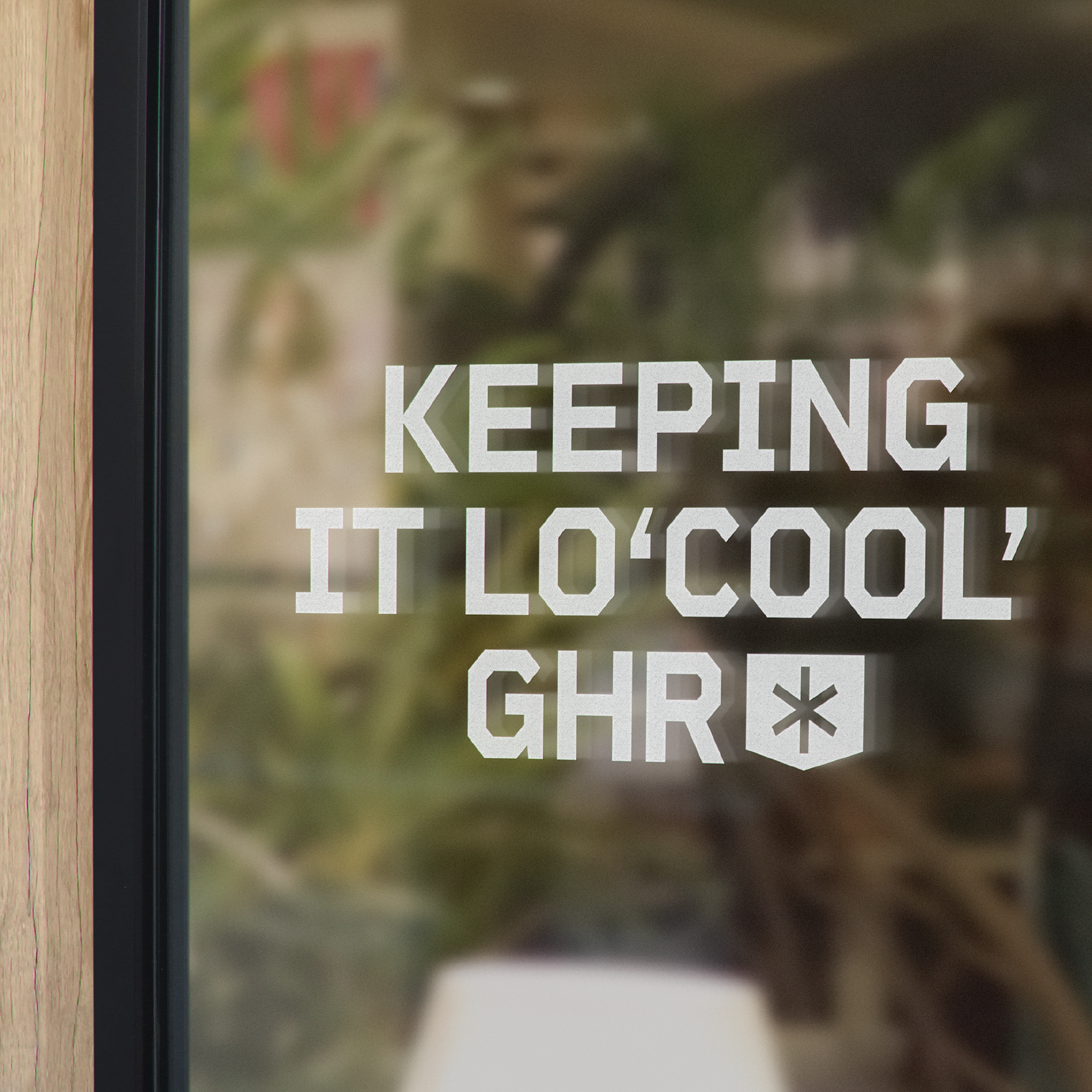
Demonstration of how brand identity would come to life
The end result was a bold design that homed in on the idea of ‘Trusted Local’ (service and products).
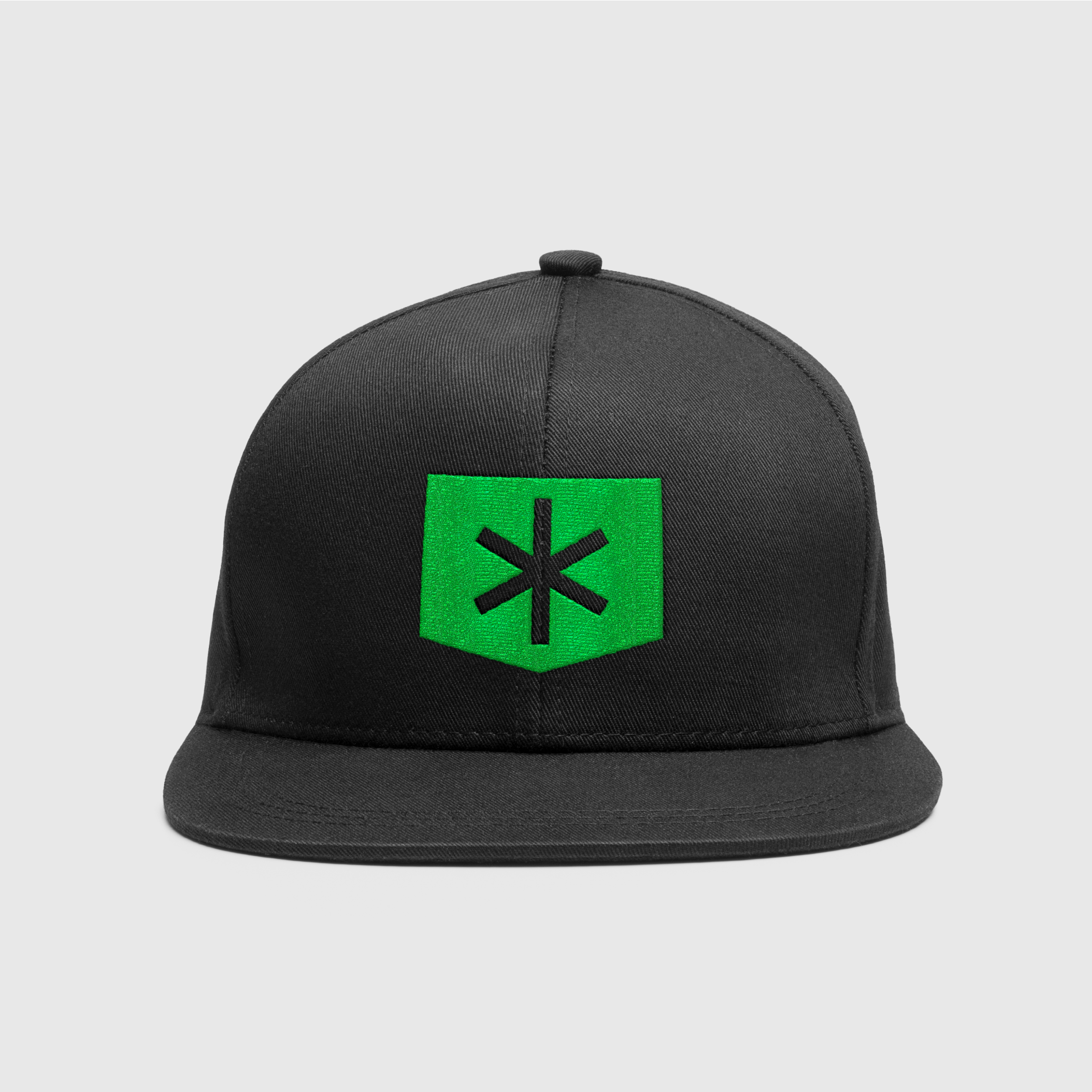
Items delivered: Brand and product positioning, brand identity, signage, branded livery, business cards, uniforms and brand toolkit document.
